History of symbols
Maps emerged with the emergence of human society and with it the need to convey complex messages.
The first maps were schematic images of hunting and fishing places, routes, difficult or dangerous areas. In addition to stone, they used birch bark, flat animal bones (for example, a shoulder blade), and clay tablets.
Conventional signs were at first drawings that conveyed individual characteristics, for example, instead of the name of a city, the coat of arms of its ruler could be depicted on the map. The outlines of objects and distances were drawn approximately. A modern person (if he is not a specialist historian) will not only not be able to “read” such a map, but will not even immediately understand that this is an image of some territory.
The oldest map (3800 BC) is considered to be a map of the northern part of Mesopotamia, dating back to the Akkadian period. On it you can find rivers, mountain ranges and cities, depicted, as now, by small circles. A way was needed to make it clear and record the number and relative location of settlements, fortresses, irrigation and other structures.
In Europe, the oldest map was carved on the “solar stone” (in Danish “solsten”) about 5,000 years ago. 2 fragments of it were found during excavations on the island. Bornholm in the Baltic Sea.
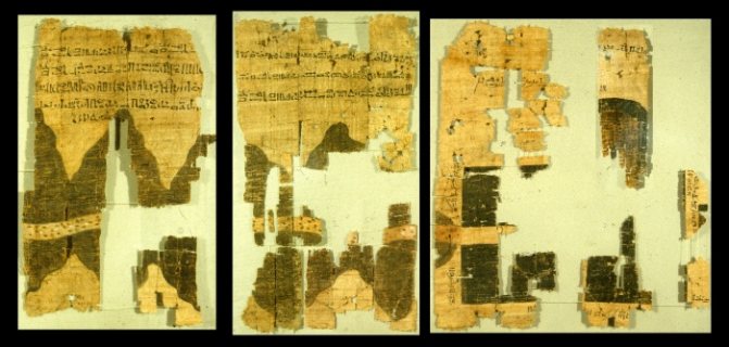
The oldest map on papyrus (“Turin Map”, after the name of the museum where it is kept) depicts a small area of a dry river bed (wadi), where gold was mined and stone was broken for construction. This map shows nearby villages and distances. It was made in 1160 BC. for the expedition organized by Ramses IV (New Kingdom).
The first world map similar to the modern one was drawn by Eratosthenes (3rd century BC), who headed the famous library in Alexandria. His map already has parallels and meridians passing through major cities. He was the first to determine the size of the Earth. His estimate of the length of the meridian on which Alexandria lies differs from the modern one by approximately 1%.
On the cards there were drawings of a mythological or biblical nature and small texts.
In the Middle Ages, much natural scientific information was lost, and cartography fell into decay. Many symbols are reminiscent of primitive maps. Only by the XI-XII centuries. Arab scientists re-collected information about the Earth and put it on the map. In the 18th century technological breakthroughs made it possible to create instruments for accurately measuring heights.
This began the development of cartography as a science, and then the unification of topographic symbols. On ancient maps, the object was often depicted from the front, for example, the city was indicated by the battlements of the fortress wall and towers. This type has been preserved mainly in point marks. Modern symbols often show a general view of the object from above.
Topographic maps and plans
There are dozens of types of geographical maps.
They are classified depending on:
- appointments;
- area covered;
- content;
- method of filming (from the surface of the earth, from the atmosphere, from space);
- scale.
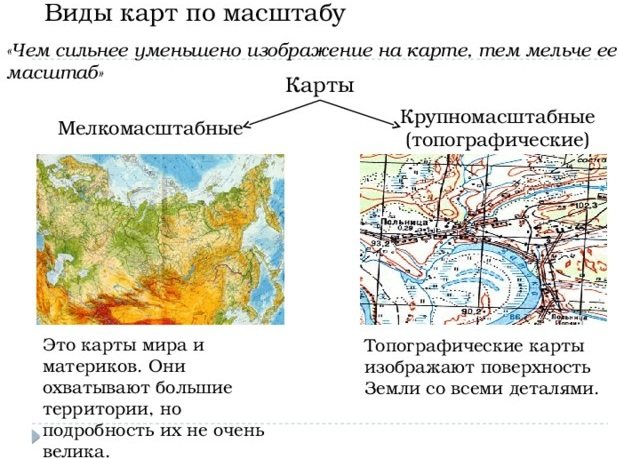
Scale is a ratio (fraction) showing how many times the length of the image is less than the length of the object itself. For example, a distance of 1 cm on a 1:10,000 map represents a distance of 10,000 cm (100 m) on the ground. Depending on the scale, there are several types of maps.
| Topographic plan | up to 1:5 000 |
| Large scale maps | 1:10 000 – 1:50 000 |
| Medium-scale maps | 1:100 000 – 1:1 000 000 |
| Small scale maps | from 1,000,000 |
The plan shows a small area, so it is drawn as if the Earth were flat. Smaller maps take into account the curvature of the earth's surface. There is no degree grid on the plan, so the direction to the north is indicated by a special sign - “north-south”, usually in the form of an arrow or a highly elongated rhombus, painted in 2 colors.
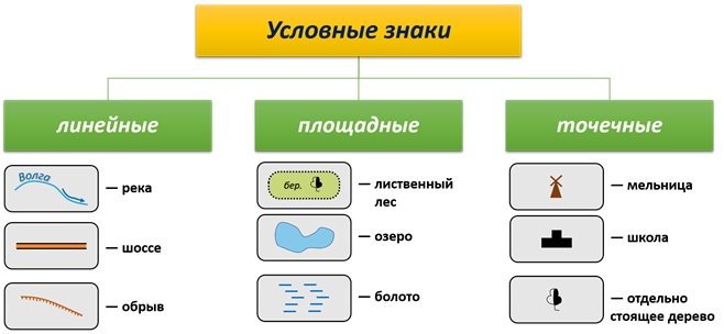
Symbols of geographical maps are usually divided into large-scale, non-scale and auxiliary.
Scale marks
Otherwise they are called area or contour. They are used to designate objects that occupy a noticeable area. Most often, they have a clear boundary, displayed on the map as solid lines or different dotted lines (contours) of a certain color. The outline is filled with characters or color.
Hydrological objects are indicated in light blue (blue):
- lakes;
- ponds;
- swamps;
- reservoirs;
- seas and oceans
- glaciers and firn fields.
Vegetation is indicated in green:
- forests;
- meadows;
- gardens;
- bushes.
Orange (yellow) color indicates some landforms:
- mountains;
- plateaus;
- plains;
- deserts.
On topographic plans of cities, a pink (red) outline indicates the boundaries of squares, sometimes streets. The linear dimensions of the contour symbols correspond to the dimensions of the object (on the scale of this map), which allows you to calculate its area and other characteristics.
Off-scale signs
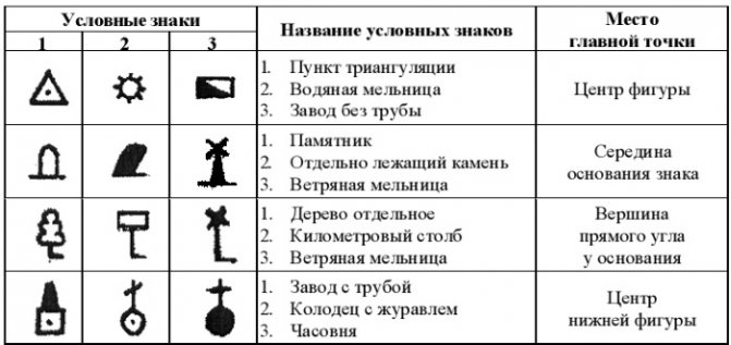
Indicate objects that are too small to be shown to scale. They are shown on large maps because they are good landmarks. The designation on the map takes up much more space than the object on the territory. Its actual position is marked by the main point of the topographic symbol (which is why it is called a point symbol).
| Type of off-scale sign | Main point | Examples of objects |
| Symmetrical (eg triangle, square, circle) | in the center of the figure | geodetic points and points, mines, churches, wells without a tower; |
| Wide base | in the middle of the base | factory chimneys, telegraph and meteorological stations, monuments, large stones, outcrops; |
| With a horizontal line at the base | at the vertex of a right angle | gas stations, windmills and engines, trees; |
| Consisting of two or more geometric shapes | in the center of the lowest | factories with pipes, oil and gas rigs, radio and television centers |
Off-scale signs indicate populated areas. Usually these are dots and circles of various sizes (depending on the number of inhabitants). The exception is large cities and megalopolises, for which contour signs are often used.
Group of topographic signs “Hydrography”
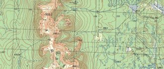
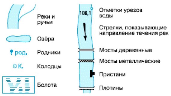
On hiking trips, water bodies are always of interest to tourists; On the banks of rivers and lakes, bivouacs, springs and springs are set up - a source of clean drinking water, etc. In the “Hydrography” group there are many topographical signs that are depicted in blue.
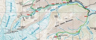
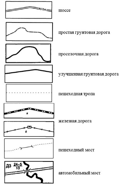
One of the main topographical signs of this group is the river sign. It can be both large-scale and non-scale, depending on the size of the river and the scale of the map. A large, wide river is depicted exactly according to the scale of the map at each section of the river bed. This topographic sign consists of two elements - the outline of the river coastline (and the coastline of the islands, if any), which is drawn with a thin blue line, and a fill sign - a blue background depicting the surface of the river, i.e. space occupied by water.
Topographic signs of the “Hydrography” group
Rivers or streams on a topographic map are represented by a thin blue line that gradually thickens from source to mouth. At the point where the small river becomes so wide that it can be depicted with a large-scale sign, the sign changes to a double blue outline with a blue background inside. There are rivers and streams that flow only in spring and early summer, and then dry up; they are depicted with a thin blue broken line. In order to know the direction and speed of the river flow, there are explanatory signs next to the topographic sign of the river. The black arrow shows the direction of the river's flow, and the numbers in the middle of the arrow indicate the speed of its flow (units of measurement - m/s).
The sea, lake, pond are also depicted by a topographical sign consisting of two elements: a thin blue line showing the contour of the shore, and a blue background - the area of the mirror of the reservoir.
An important hydrographic topographic sign is a sign indicating water sources - a well, a spring. These objects are indicated only on large-scale maps. The well sign is a blue circle with a diameter of slightly more than 1 mm with a blue dot in the center. Springs and springs are indicated by a blue circle with a “tail”.
Read: Tights, tetra-packs, ... What to store food in when camping?
There are two types of swamps: passable and difficult to pass through, through which it is dangerous to move and must be avoided. Accordingly, there are two signs of swamps: short horizontal strokes grouped in the shape of irregular diamonds are passable swamps, and solid horizontal blue strokes are impassable swamps. The figure shows a conventional topographic sign - passable swamps.
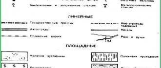
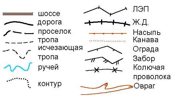
Linear signs
Symbols of geographical maps that display an extended object, the length of which is many times greater than the width (pipelines, power lines). Blue indicates rivers, black indicates borders and roads (solid line or dotted line). Freeways, highways, and improved dirt roads are sometimes highlighted by filling the outline of the linear sign with orange (yellow) color.
Railways are depicted in great detail.
Using different lines, the map shows:
- number of paths;
- status (operating, under construction, dismantled);
- track width;
- electrification of the road.
The peculiarity of a linear sign is that it is scaled in length and non-scaled in width. The thickness of the line reflects the economic importance of the object, and not its size.
Group of topographic signs “Roads and road structures”
Roads, paths, routes are an extremely important object of a topographic map, which serves not only for the movement of tourists, they are an important landmark. On topographic maps, all roads are divided into: railways, highways and unpaved roads.
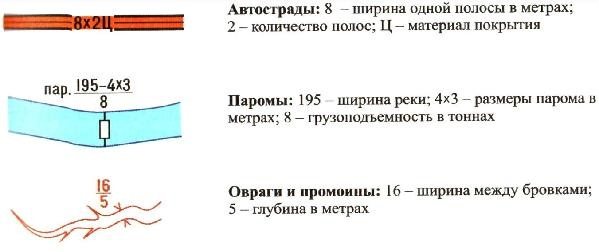
Highways are roads that have a specially made hard artificial surface - asphalt, concrete or stone (cobblestones, paving stones). The conventional topographic highway sign consists of two thin, black lines, parallel to each other, the gap between which is 8 or 1 mm and is filled with red (orange) paint. As already mentioned, a highway sign is non-scale in width, but sometimes it is very important for those who use highways to know its width. Therefore, at the highway sign on the map, an explanatory sign is given in the form of an alphanumeric characteristic: a number, another number in brackets and a letter. For example, the explanatory sign “8(12)A” on a highway means; that the width of this highway with pavement is 8 m, the width without pavement is 12 m, and the letter indicates the material from which the pavement is made. In this case it is asphalt.
Topographic signs of the group “Roads and road structures”
Thus, the first number is the width of the highway surface in meters, the number in brackets is the width of the entire highway surface in meters including shoulders.
The letter indicates the material with which the highway is covered:
- if it is asphalt, then the letter A is placed;
- if concrete - letter B;
- cobblestone or paving stone (i.e. stone), then the letter K.
Dirt roads are earthen roads that do not have artificial surface; they can be partially or entirely strewn with gravel, crushed stone, slag, but this is not a hard surface. All dirt roads are divided into simple (field or forest), country roads, and improved dirt roads (UGD).
A simple dirt road is indicated on maps by a dashed (broken) black thin line, the length of the strokes should be 3-4 mm, and the length of the space between the strokes should be about 1 mm.
A country road is more important than a simple one. It is more well-trodden and exists, as a rule, for many tens and even hundreds of years. Country roads connect small settlements to each other (village to village, railway station) or small settlements to large ones (village to city). The difference from a simple dirt road going through a forest to a clearing or through a field to a haystack is that a simple dirt road can suddenly end somewhere in the forest or field, while a country road will definitely lead to some populated area or to a major road. Therefore, a country road on topographic maps is indicated by a more “confident” solid thin black line.
An improved dirt road is an earthen road that does not have a hard artificial surface, but is sprinkled with gravel or crushed stone, compacted with a roller and leveled on the sides of a ditch. The topographic sign of the UGD, like a highway, consists of two thin black lines parallel to each other (the width between them is 0.6 - 0.8 mm), the space between them is filled not with orange (as when marking a highway), but with yellow.
Most often, tourists travel on hiking trails. Pedestrian trails have important features:
— no one specially lays paths, they arise by themselves from the constant walking of people in the same direction; – paths have an insidious property: they can suddenly disappear and reappear somewhere else.
In a densely populated area, often a whole network of paths can go in the same direction at once, which then join and then diverge again. This is especially common in places where herds of cows, goats, and sheep are constantly being driven around. It is impossible to depict such a multitude of paths on a map, so a group of paths is shown with one conventional path in the corresponding direction. Of course, not all paths are marked on the map; There are temporary paths of the same age that are not shown on maps; this must be taken into account. Only long enough and permanently existing trails (they are sometimes called centuries-old) are plotted on large-scale maps.
Read: A clubfooted bear is walking through the forest, and tourists meet him... What to do?
The symbol for a trail is almost the same as the sign for a simple dirt road - a thin black dashed line, but each stroke is shorter. The length of the stroke is 2 mm, and the space between the strokes is slightly less than 1 mm.
The topographic sign of the railway has also undergone changes recently. As you know, a railway can be single-track or have several tracks. In addition, you need to know that railway tracks can be narrow-gauge or broad-gauge, along which passenger and freight trains run. The narrow-gauge railway is designed for small carriages and platforms on which small loads are transported - timber, peat, soil (sand, gravel, crushed stone), etc.
The railway on the map can be represented as a solid thick black line (its thickness reaches 0.6 mm) with white stripes - an electrified road or a solid black line with transverse strokes - a non-electrified one. The number of cross strokes indicates the number of tracks; two short strokes across the railway sign indicate that it has two tracks. Three strokes indicate that this railway is multi-track.
On simple dirt roads, as a rule, wooden bridges are built; on highways, improved dirt roads and on important country roads, bridges are most often concrete (stone), but sometimes wooden. On railways, large bridges over large rivers are always metal, and over small rivers - concrete.
Topographic signs of bridges are shaped and non-scale signs. Where a bridge sign is placed on the map, the road and river signs are broken. An explanatory sign for bridges is the alphanumeric characteristics of the bridge. The letter indicates the material from which the bridge is built (D - wood, K - concrete). The coefficient is the height of the bridge above the water surface. In the numerator of the fraction, the first digit (20) is the length of the bridge in meters. The second number (4) is its width in meters. In the denominator, the number 10 shows the load capacity of the bridge in tons, i.e. what is the maximum weight of the vehicle the bridge was designed for when it was designed.
Explanatory signs
They come in two types - ideographic (drawings) and alphabetic. Symbols of geographical maps are often a combination of scale and off-scale symbols with explanatory ones.
Explanatory symbols of geographical maps look something like this
They provide additional information, for example:
- short transverse strokes can indicate the number of railroad tracks or the direction of the slope (to distinguish a depression from a hill);
- schematic, generalized drawings mark the position of bridges, tunnels, overpasses, and stations. They are often accompanied by letter signs (width, height, length of the structure);
- the symbol of a coniferous or deciduous tree indicates the predominant species (in combination with a large-scale forest symbol);
- arrows show the direction of winds, currents, and traffic.
Letter explanatory signs include:
- names of parts of the world, countries, regions, settlements, hydrological objects;
- names (within the contours) of tree species, types of shrubs, numbers indicating the average values of height, thickness, distance between trunks;
- letters and numbers characterizing the type of road surface, the width of the road surface, the distance between the ditches;
- inscriptions next to the designation of the bridge, overpass (material of construction, linear dimensions, load capacity).
Sometimes maps contain short explanatory text if the object has important features. Abbreviations adopted in cartography are standardized. The meaning of each can be found in the list of abbreviations usually included in the map legend.
Don’t miss the most popular article in the section: Where the Yenisei River flows, source, mouth, description, where it is located.
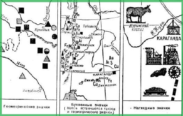
Symbols of mineral resources on maps
Deposits of certain mineral resources are marked on a number of maps: general geographical, geological, economic and others. In this case, special designations of minerals are used. They belong to the category of non-scale cartographic signs.
Geographical designations for minerals used in cartography are generally accepted. You can see what they look like in the diagram below. These signs are studied at school as part of the subjects of general geography and natural history. They can also be found in school and thematic atlases.
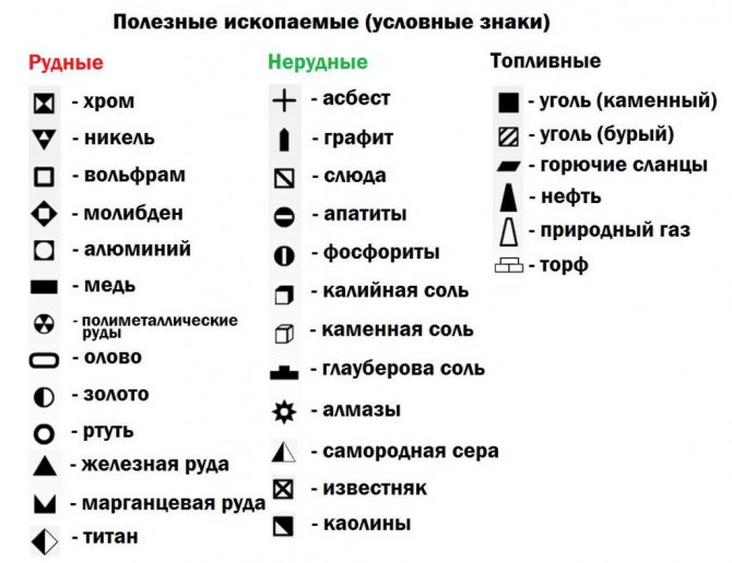
In addition, there is a special GOST number 2.857-75, which was developed by a number of Russian scientific institutes. This standard specifies not only the designations of minerals, but also the conditions of their occurrence. However, these signs are used exclusively by geologists. Thus, diamond deposits in this GOST are designated in red, sulfur – lemon, oil – brown, rock salt – purple.
But we will still return to those designations of minerals that are widely used in cartography. Let's take a closer look at what the symbols look like for those mineral resources that are of the most industrial importance in the modern world.
Isolines
Isolines, unlike linear symbols, do not correspond to any material objects. They connect points with the same value of some quantity.
| Line name | Magnitude |
| isohypsum (horizontal) | height above sea level |
| isobath | depth |
| isobar | Atmosphere pressure |
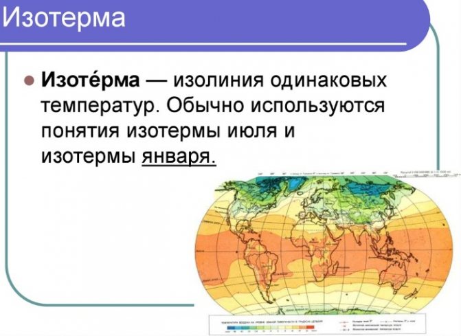
| isotherm | temperature (air or water) |
| isohista | precipitation |
| isotach | wind speed |
For example, a hill is depicted by several closed lines (isohypses) having a common center. Short perpendicular lines on the lines (berg strokes) show the direction of the slope; sometimes a number is written at the breaks in the line indicating the height above the zero mark in meters. Frequent lines indicate a steep slope, rare lines indicate a gentle one.
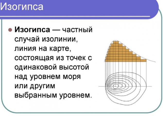
The top is marked with a dot with a number (height of the hill).
Group of topographic signs "Relief"
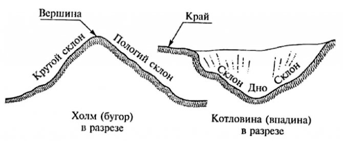
The surface of our planet always has irregularities - hills, hills, depressions, ravines, cliffs, etc. All this represents the topography of the area. Relief is a set of irregularities on the earth's surface. All irregularities are generally divided into two types - positive and negative forms of relief. Positive forms of relief include mountains, hills, ridges, mounds, etc. Negative lowlands, basins, gorges, valleys, ravines, pits, etc. Positive and negative landforms always alternate in space. Each landform has three elements. For positive ones - the top (plateau), the bottom (the base - the beginning of the hill) and the slopes; for negative ones - the bottom (lowest part), edge, slopes or walls.
Positive and negative elements of relief
In addition, the terrain can be simple - flat terrain, or complex - mountainous terrain. Based on the nature of the relief, flat terrain is divided into three types: slightly rugged, moderately rugged and highly rugged terrain. The ruggedness depends primarily on the frequency of alternation of positive and negative relief forms, as well as on their height and steepness of the slopes. Flat terrain with a small number of hills and hills is slightly rugged, and where the terrain is very rugged, there are many hills, ravines, gullies, the terrain is considered very rugged.
Cliffs
Slopes, a common element of both negative and positive landforms, can be steep, steep (sharp) and gentle (smooth). In this regard, on topographic maps, smooth, soft forms are depicted with thin brown lines - horizontals, and sharp, steep forms - with a special brown line with jagged edges. The tops of the teeth are directed in the direction where there is a steep slope or cliff.
Accordingly, if a group of tourists needs to go from point A to point B, then they will have to think about how to climb up a steep, steep slope, and perhaps provide an overhead belay. If the route goes, on the contrary, from point B to point A, then you need to prepare to carefully go down the cliff. Tourists should always take this into account when planning travel routes! Such steep slopes can be found along the banks of rivers and reservoirs, near ravines, and on mountain slopes. In addition, in nature there are cliffs of artificial origin that arose as a result of human economic activity. These are objects such as a quarry, a pit, or there may be artificial embankments or dams. In order for such artificial objects to be easily distinguished from natural ones on the map, they are marked with exactly the same jagged line, only its color is black.
Topographic signs of the "Relief" group
A quarry is a place for the extraction of building materials, a frequently encountered artificial object in the area of industrial centers. On maps, the quarry is depicted as a horseshoe-shaped depression with steep slopes. Quarries are used for the extraction of sand, stone, clay, as well as minerals - ore, so next to the quarry sign there is an inscription specifying what exactly is mined in this quarry. The number next to the sign also shows the depth of the quarry.
Read: How to protect yourself from mosquitoes in the forest
Pits and mounds are similar topographical signs and can also be of artificial or natural origin. On a topographic map they can be depicted while maintaining scale, if the scale of the map allows this, or they can be off-scale. The number next to the sign of the mound and pit indicates their height and depth in meters.
Sometimes, during the construction of railways or highways, at the intersections of river valleys and deep ravines, an artificial earthen embankment is built, which can have rather steep slopes. Such embankments and excavations are depicted on maps with a jagged black line, since they are artificial structures. If the teeth on the line with their sharp ends are directed away from the railroad or highway bed, then this is a sign of an embankment, where they are directed, on the contrary, towards the road bed - a cut. The numbers next to the topographic sign indicate the highest height of the slope of the embankment and excavation.
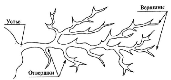
The structure of the ravine
There are also more complex hard forms of relief - ravines. A ravine is a landform that forms in loose sedimentary rocks in the form of relatively deep, unturfed depressions formed by temporary watercourses when snow or rainwater melts. Gullies are a “living” phenomenon; they appear, grow and gradually disappear. Young ravines are called gullies. The gullies have very steep slopes, but gradually they crumble, flatten out, and are overgrown with grass and bushes. When a ravine stops growing, it turns into a beam or hollow, a hollow. Beams and hollows are already classified as soft forms of relief, therefore they are indicated on the map by a line without teeth.
A ravine has a top - this is the place where it begins, a bottom and a mouth. The ravine grows, like the trees, at the top. A ravine can branch in different directions, forming several small ravines, each of which has its own peak. Such branches are called “screwdrivers” - side branches that flow into the main ravine.
Two typical representatives of soft landforms are antipodes: a hill (hillock) and a basin (depression). You cannot show them with a jagged line on the map, since their slopes are gentle and smooth.
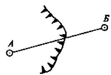
How can you depict them on paper? Topographers came up with this method: if you “cut” horizontally, dissect the shape of a hill into even “slices,” then the entire hillside will be surrounded by several closed lines of “cuts”—horizontals. If you then draw these lines on paper, you will get a figure that gives an idea of the relief.
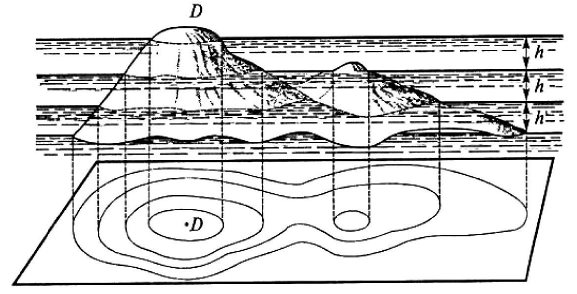
Horizontal sections of relief
You just need to use short strokes on the horizontal lines to show in which direction the slopes go down, since exactly the same figure will be obtained if you cut through the basin with horizontal planes. Without showing these strokes, we can only guess whether point D on the map is the top of a hill or the bottom of a depression. Such strokes, showing the direction down from the horizontal, are called berg strokes (from the German “berg” - mountain). This method of depicting soft relief forms on maps is called the contour method.
Contour lines and berg strokes on the map
In addition, on some horizontal lines, in convenient places, numbers are written in brown, which indicate the height of this horizontal line in meters above sea level, or, as is customary in topography to call this value, the horizontal mark.
Relief depiction on plans and maps
Symbols of geographical maps may vary in color. On smaller maps this is how the relief is shown. The plains are filled with green, the hills with orange-yellow. The color intensity increases with altitude.
The same principle of layering is used to show depths with different shades of blue. In the map legend, the color table is located under the lower, “southern” frame and is called the height and depth scale. Each shade is associated with a certain (usually standardized) interval.
The image of the relief form must be plastic. To create a three-dimensional effect, in addition to filling, washing and shading are used. This allows you to better perceive the main elements of large forms and their relative position.
Like scale symbols, the display of the relief is metric, that is, from the map you can determine the length of a mountain range or the steepness of the slopes.
Designation of an anthill on the site plan
An anthill is a good natural landmark. Its designation on the terrain plan, symbols and marks are not typical for large maps. The northern part of the anthill will always be insulated, while the sunnier southern part will be light and filled with passages. An anthill adjacent to any natural fence will always point south.
Designation of the anthill on the site plan:
- On larger maps it is marked with a cross or a brown oval with a scale dot. As, for example, in sports orienteering. In the legend it is marked with a number and a text name.
- On small drawings, it is allowed to depict a brown circle or sign a specific point.
- In schematic drawings, local areas can be indicated as miniatures.
Mapping methods
In addition to cartographic icons, linear and scale symbols, isolines, other methods are used on highly specialized maps.
Localized charts
Reflect phenomena that are continuous in nature, for example, air temperature.
Each diagram of changes in average monthly temperatures is linked to a specific observation point.
Spot method
Used for mass phenomena that cannot be considered continuous. Plowing the land is shown with a contour sign with dots inside. Each point has a “weight”; for example, 500 hectares of plowed land correspond to it. This method is used to reflect population density, number of livestock, and other indicators.
Sometimes it is more clear to use the percentage point method. Then the “weight” of a point does not express an absolute value, but a certain proportion of the total quantity (percentage).
Traffic signs
Geographic maps are not always static. Conventional signs can show the dynamics of a phenomenon.
- Motion vectors (arrows) often indicate the direction of air and water flows.
- lanes (ribbons) are needed for a detailed description of the flow (population migration, cargo transportation). For example, the structure of railway cargo can be depicted by various shading, and power - by the width of the traffic belt.
Map diagrams
Used to plot absolute values of any indicator.
Within each administrative-territorial unit, a diagrammatic sign is drawn, the size of which corresponds, for example, to energy consumption or the amount of agricultural production in a given area.
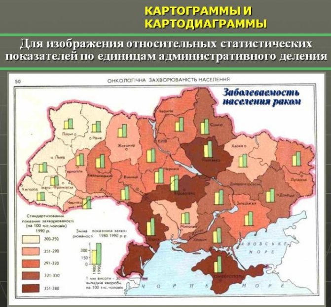
Cartograms
For relative indicators (for example, infant mortality per 1,000 population), areas in the administrative division grid are filled with various shading or a certain shade in accordance with the interval scale.
A refined cartogram (dosimetric method) places shading only in the place where the phenomenon actually spreads. For example, a population density map excludes wetlands and high mountain areas. In this way, a map of quantitative areas is obtained.
Symbol scale
Objects of the same type are indicated by identical signs of different sizes. For example, a circle representing a city with a population of 100,000 people. 2 times larger than the circle indicating a place with a population of 1,000 people. Such signs form a sequence, a scale.
The sign scale is:
- absolute (the size of the sign changes proportionally to the value) or conditional;
- continuous (the size of the sign increases gradually) or stepped (interval). The latter can be equal-interval or uneven.
In the given example, a conditionally stepped uneven scale of signs is used.
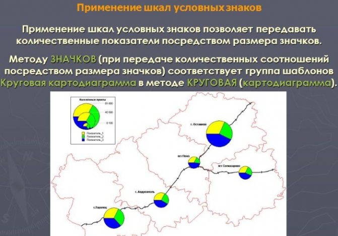
It means:
- the size of the circle increases more slowly than the number of inhabitants;
- each size corresponds to a certain interval;
- these intervals differ from each other.
Conventional signs on geographical maps - methods of cartographic representation
Conventional signs on geographic maps convey the quantitative and qualitative characteristics of objects, show phenomena not perceived by the senses (magnetic declination), areas inaccessible to human vision (the structure of the earth's crust at great depths), represent scientific concepts, generalizations, and abstractions. To correctly convey the necessary information on a map, a cartographer must understand display methods.
Currently, the following methods of cartographic representation are used to convey content on geographic maps:
- icon (localized icons, punches);
- qualitative and quantitative background;
- habitats;
- traffic signs;
- point method;
- isolines (isolines with layer-by-layer coloring);
- map diagrams;
- cartograms;
- localized diagrams;
- linear signs.
Icon method
They are used to designate objects located on the ground, but not expressed on a scale: settlements, industrial and agricultural enterprises, mineral deposits, etc. The icon method is more often used on socio-economic maps. Quantitative characteristics are conveyed by the size of the icons, their linear, areal or volumetric dimensions. Qualitative characteristics are conveyed by color, shading and shape of the icons.
Three types of icons are used:
- geometric - have the shape of simple figures (circles, squares, rectangles, triangles, etc.). They can be simple and structured. Each icon on a particular card has a specific, single meaning, but the same symbol can have different meanings on different cards.
- alphabetic - one or two letters explaining the displayed object or phenomenon. Traditionally used to designate mineral deposits. To improve readability, they are often enclosed in simple geometric shapes: circles, squares.
- artistic pictograms (visual icons) – the design resembles the depicted object or its symbol (anchor - seaport). They are the most visual and allow you to read the map without referring to the legend. These icons are often used on educational maps for young children, tourist maps, and advertising maps.
Icon method
Method of linear signs
This method underlies all cartographic images; not a single map is complete without linear signs. They display objects located linearly on the ground, while conveying their location and features (borders, flow direction, glaciation boundaries, tectonic faults, oil pipelines. The length of these objects can be expressed on a map scale, but their width cannot (canals, rivers, roads, front lines, boundaries, tectonic fault lines of the earth's crust, sea shores, etc.) There are two options for linear signs:
- as a category of linear signs on topographic maps;
- as a special way of displaying special objects and phenomena on thematic maps (the legend must contain explanations of these phenomena and objects).
The pattern and color usually convey qualitative characteristics (types of the road network, types of coasts, lines of warm and cold fronts, lines of military fronts, etc.), and the width of linear characters convey quantitative characteristics (tide levels, flood strip during floods, etc.) . Qualitative differences between linear signs on the map are made easier by the fact that many linear objects have their own specific display. For example, the straightness of highways contrasts well with the sinuosity of river networks.
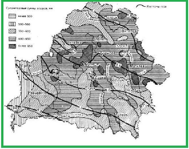
Isoline method (isolines with layer-by-layer coloring)
Isolines are curved lines connecting points with the same specified value of some indicator. The isoline method is used to depict quantitative phenomena that have a continuous distribution and gradually change in space, such as relief, temperature, precipitation, air pressure, and dates of occurrence of the phenomenon.
Depending on the phenomenon being displayed, the isolines are called:
- isohypses (horizontals) – lines of equal absolute heights,
- stratoisogypsum – lines of the underground structure of the relief,
- isotherms - lines of equal temperatures,
- isohyets - lines of equal amounts of precipitation,
- isobars – lines of equal air pressures,
- isobaths - lines of equal depths,
- isogons – lines of equal magnetic declinations,
- isocols - lines of equal distortion on maps,
- isochrones - lines of one date of occurrence of a phenomenon,
- isodemes - lines of equal population density,
- isochores – lines of equal volumes;
- isoquants - lines of the same volume of product production depending on production factors;
- isopachs – lines of equal thickness of rock layers;
- isoanemones – lines of equal average annual wind speeds;
- isohalines - lines connecting points with the same salinity of water.
Berghstrich is a line drawn perpendicular to the isoline and indicating with its free end the direction of decrease in the value indicated by the isolines (for isohypses and isobaths - in which direction the slope decreases). Initially, the berghstroke was used to depict the terrain with horizontal lines, to more easily determine the direction of the slopes.
Isolines are sometimes used to show phenomena whose magnitude does not change gradually and the phenomena themselves do not have a continuous distribution, for example, population density, forest cover, etc. Such isolines are called pseudo-isolines, since they connect numbers that characterize phenomena not at a point, but over an area (even a small one).
Using the isoline method, you can show not only statistical, stationary phenomena, but also map dynamic processes, display the timing of the occurrence of phenomena, the speed of movement of processes, etc. On dynamic electronic maps, contour lines can shift themselves, reflecting the movement of a phenomenon (for example, cold and warm air masses).
For greater clarity, the areas between isolines are painted with a color, the saturation of which increases as the quantitative indicator increases, or, in some cases, shading is applied, the density of which increases with increasing intensity of the phenomenon being mapped.
You can combine several isoline systems on one map, but only one can use layer-by-layer coloring. Qualitative differences between phenomena are conveyed by the color of the isolines (for example, red - positive temperature isotherms, blue - negative temperature isotherms, black - zero temperature isotherms).
The method of isolines (isolines with layer-by-layer coloring) is widely used on climatic, hydrological, tectonic, hydrogeological and other maps.
Isolines
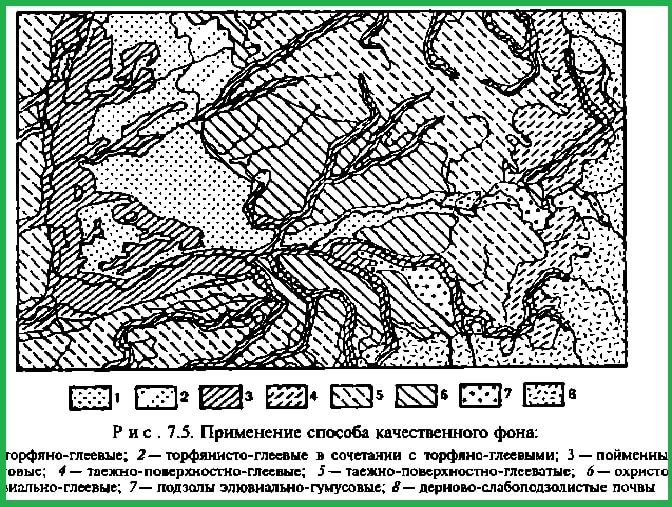
Quality background method
The qualitative background method is used to demonstrate phenomena that are continuous or massive in nature (specialization of agriculture, soil type, etc.). High-quality zoning of the territory into homogeneous areas is indicated by filling with color, shading, inscriptions or icons. If there are many sections and among them there are typologically repeating ones, then they are additionally numbered or highlighted with letters.
For some maps, such as soil and geological maps, standard classifications, coloring scales and indices have been developed.
In other cases, using this method, territories are distinguished that are distinguished not by one characteristic, but by a complex of characteristics: climate types, natural zones, political and political-administrative division of territories, agricultural specializations. The division between zones is done either with the help of lines - the boundaries of territories, or without them, if the transitions of the phenomenon are not abrupt, but gradual. Thus, states on a political map are highlighted in color, their administrative divisions are marked with lines, and historical areas are marked with inscriptions. The qualitative background method is widely used on nature maps (geological, soil, geobotanical, physical-geographical zoning, etc.) and some socio-economic maps (agricultural and other zoning).
Quantitative background method
Reflects the division of the territory into homogeneous areas according to a quantitative indicator (or indicators). To compile such maps, it is necessary to study in detail the quantitative characteristics of a particular phenomenon, for example, the density of the river network. They are shown in colors of different saturations or corresponding shading.
The quantitative background method is used mainly for drawing up maps of nature (geomorphological, hydrological, hydrogeological, etc.), but it can also be found on socio-economic maps, for example, on population density maps.
Method of habitats
Areas (Latin “area” - territory, area) designate on the map areas of continuous (for example, glaciation) or scattered (rice cultivation) distribution of phenomena. More often, this method shows the placement of plants, animals, agricultural industries, and minerals. In the legend, the conventional sign of the area is explained with the words “district (area) of distribution.”
The range of phenomena depicted using the area method is quite extensive. The only condition applicable to them is the non-university of its distribution; this is the main difference between the method of high-quality background and habitats, although they are similar in technical design.
The area method is used mainly for the qualitative characterization of the mapped territory, although an area can also be distinguished based on quantitative characteristics (for example, an area where the average population density is more than 20 people per km²).
The area method is widely used on zoogeographical, geobotanical (areoles of animals and plants) and other maps of nature, as well as on socio-economic maps that display, for example, areas where certain agricultural crops are grown.
It is often used as an additional method. For example, on an economic map, zones of agricultural specialization are shown using a qualitative background method, and additionally, against the background of coloring the habitats using special signs, the places of cultivation of individual crops (sugar beets, tobacco, etc.) or the areas of the most developed horticulture are displayed. Areas can generalize in the iconic way. For example, individual icons of deposits of a certain mineral can be combined into a basin of this mineral.
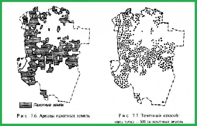
Point method (quantitative method)
Intended to indicate quantitative indicators, both distributed over any territory and located in certain areas of the mapped surface. Points - circles, squares, dashes, etc. are concentrated to varying degrees. The more widespread the phenomenon in a given area, the denser the concentration of points. Such points on maps have a certain weight, which is indicated in the map legend.
There are two ways to place points on the map:
1) statistical (schematic) - points are placed exclusively evenly within the administrative-territorial division without taking into account the actual location of the phenomenon. Using this method, it is impossible to determine the actual location of the phenomenon on the map; you can only compare the intensity of the phenomenon in different areas based on the different density of points present in them. In these cases, it is necessary to take the smallest territorial units (instead of districts, agricultural enterprises, village councils, etc., their boundaries can be removed later) in order to place the points in the most localized manner;
2) geographical - points are placed only in those places of areas in which the phenomenon is really widespread (for example, when compiling a dot map of crop areas, swamps, forests, meadows, etc. are excluded).
When using multi-colored dots (or various small figures - triangles, rectangles, dashes), you can display not only quantitative, but also qualitative relationships (for example, on a map of the distribution of industrial crops, green dots show fiber flax, red dots show sugar beets). In other cases, the color of the dots or their shape can show the dynamics of the phenomenon (for example, the increase in acreage over a certain time).
Traffic sign method
Used to show the movement in space of natural and socio-economic objects and phenomena:
- point (ship movement),
- linear (movement of military fronts),
- area (economic ties of the country),
- continuous (air masses),
- scattered (movement of birds and animals) distribution.
The main graphical way of showing movement is vectors (arrows), which can differ in orientation, shape, size, lightness, color, and internal structure. Another way is to use tape strips (diagrams) of parallel lines. Qualitative differences are conveyed mainly by color or shading (for example, red arrows - warm currents, blue arrows - cold currents).
The power of a phenomenon (for example, cargo flows) is usually shown by the width of strips (diagrams), the commensurability of which can be (as with the icon method) absolute or conditional, continuous or stepwise. Quantitative characteristics can also be displayed by large-scale parallel lines.
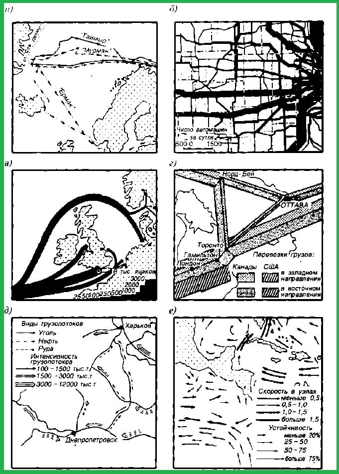
Traffic signs
This method is most applicable on maps of transport, economic relations, climate, oceanography, travel, etc. They show the movement of expeditions, military units, passengers and cargo, air masses, water in the oceans and seas, animal migration, etc.
Card diagram method
Map diagrams display the total (mostly absolute) dimensions of any phenomena within certain units of territorial division (crop area, total timber supply, population). A map diagram allows you to quantitatively compare individual parts of a territory for some phenomenon.
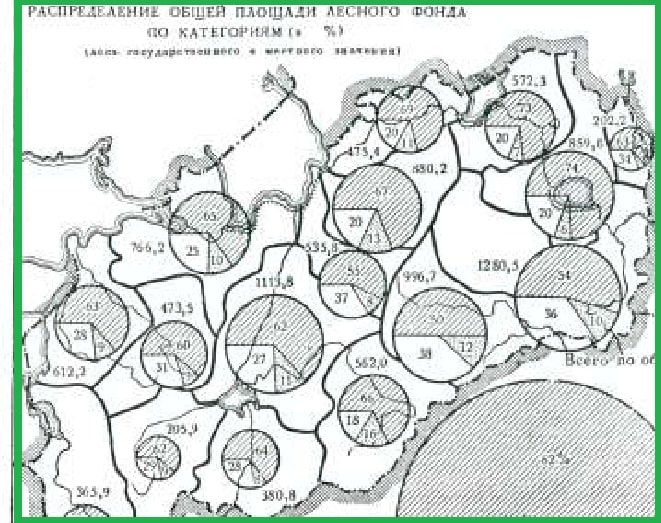
Structural map diagram
They are built in the form:
- linear charts - bars, stripes, etc., the length of which is proportional to the values being compared;
- volumetric diagrams - cubes, spheres, etc., the volume of which is proportional to the quantities being compared.
In this way, you can show the structure of a phenomenon; for this, for example, a circle is divided into parts and they are distinguished in different ways.
Profile charts
Cartograms
A method of displaying on a map not absolute, but relative sizes of phenomena, average for a particular area. In this way, predominantly socio-economic phenomena are demonstrated:
- population density;
- percentage of arable land to the total area,
- percentage of any agricultural crop to the total sown area
- number of schools, libraries, hospital beds, etc. for a certain number of residents, etc.
The method is also used to show natural phenomena (forest cover, swampiness, etc.). A cartogram can convey changes in the average magnitude of a phenomenon over a period of time.
The size of the phenomenon is expressed by background coloring or shading according to the principle: the higher the indicator, the more intense the coloring, the thicker the shading. In this case, the boundaries of the plots must be clearly marked. However, there are smoothed cartograms where the boundaries of areas with similar indicators are not indicated.
In modern cartography there are many types of cartograms:
- structural cartograms showing the percentage of parts of a phenomenon in each cell;
- cartograms made in the form of block diagrams in which the height of the volumetric columns is proportional to the intensity of the phenomenon;
- Cartograms built on a grid of map squares are becoming increasingly recognized; they are convenient for automatically compiling a cartogram directly from topographic maps.
Cartogram
Localized chart method
Used to show phenomena that have a continuous distribution over a large area. Show the absolute or relative dimensions of a cartographic phenomenon at individual points on the earth's surface. The size of phenomena is expressed by diagrams constructed on a certain scale and placed in certain places. This shows temperature, pressure, thickness of snow cover, etc.
The method of localized diagrams is used when they want to characterize only certain points on the ground and not show the magnitude of the phenomenon over the entire area. Diagrams are constructed in a rectangular (Cartesian) or polar (“rose” diagram) coordinate system.
This method is used mainly to show seasonal and periodically recurring phenomena on climatic (for example, graphs of changes in average monthly temperatures and precipitation localized by weather stations), hydrological (diagrams of river water pollution associated with gauging stations, etc.) and less often other maps .
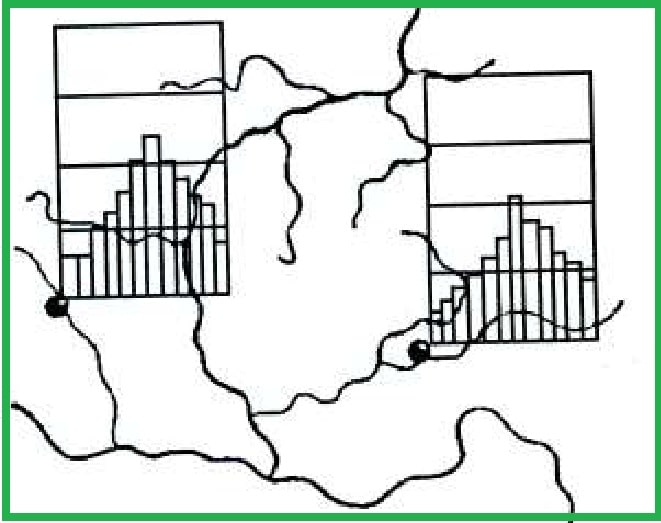
Localized charts
Rules for drawing symbols on the map
In addition to the rules already mentioned, there are others:
- For clarity, the symbols are shaded as if the light were falling on them from the left and from above. Therefore, make thicker lines at the bottom and right in the case of objects protruding above the surface, at the top and left for depressions.
- Off-scale signs are applied with an accuracy of 0.1 mm, which at a scale of 1:5,000 gives an error of no more than 5 m. On topographic plans their size is 1.5 times larger than on large-scale maps.
- The vertical axis of these signs is perpendicular to the upper (northern) edge of the sheet.
- The shrub is depicted by small ellipses, the long axis of which should be parallel to the upper edge of the leaf.
- City blocks are depicted as contour symbols filled with shading (the same throughout the map).
- The shading representing swamps is parallel to the upper edge of the sheet, and the salt marshes are perpendicular to it.
- Small bends of borders and other lines are generalized (map generalization). Large bends that can be used for orientation are required.
- Explanatory signs and other inscriptions should be parallel to the top edge. An exception is the names of tracts, rivers, and some other bodies of water, which are located along the axis of the object, sometimes parallel to its edge.
Modern geographical maps are very informative. To read them, you first need to learn the “alphabet”, which is the symbols.
Article design: Vladimir the Great